INDUSTRY:
Entertainment
CLIENT:
QubicaAMF
YEAR:
2022
EXPERIENCE:
Senior product designer
NEOVERSE

about.
Qubica AMF is a leader in the bowling industry, producing software, services and equipment for the global bowling market. Starting with this project, they wanted to renew and transform the entire ecosystem of their software interfaces for on-lane services, linking 3 areas of the company together on a Conqueror X system manager software. In particular, my work focused on renewing, redesigning, and rethinking two large interrelated areas: Technical Lane Options and On-Lane Entertainment.

Opportunities.
We encountered exciting opportunities for improvement in those projects. Firstly, we recognized the potential in the B2B2C market, targeting B2B customers while keeping the end user (bowlers or entertainment center consumers) at the forefront. Secondly, we embarked on creating a robust 'user dialogue' system. By understanding the needs and frustrations of bowling/entertainment center users and managers, we aimed to enhance our software interface with purpose and precision.
My role.
As a Lead Product Designer, I’ve had a multifaceted role. Initially, I was part of the UX & Analysis team, where I focused on improving user experiences and analyzing data. Later, I transitioned to a specific product team, diving deep into particular products or services. As a UI Designer, I implemented design systems across our product ecosystem, ensuring consistency. Additionally, I contributed to the adoption plan for the design system, promoting its use within our organization.
The Approach.
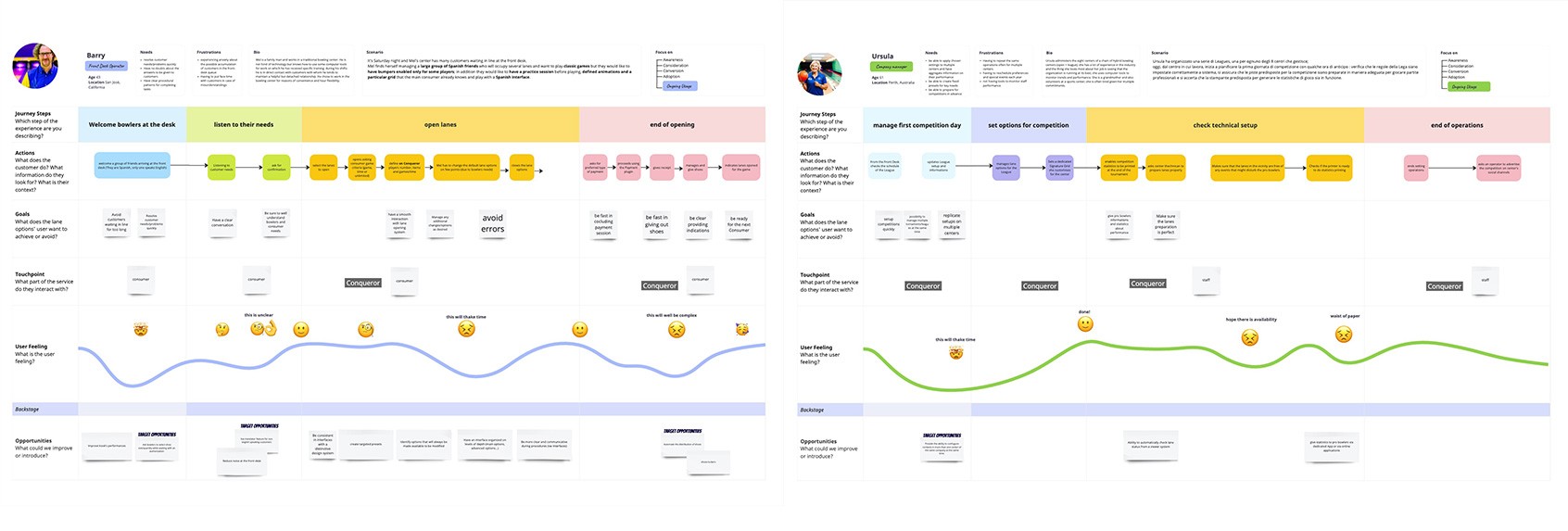
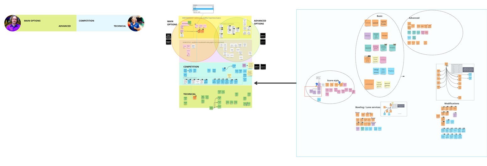
We conducted product research and discovery for both QDesk and Neoverse, focusing on user personas and end consumer goals. After brainstorming, hypothesizing, discussing, and approving ideas with the product team, I collaborated with my analysis colleague to identify the best structure and organization for the options and pages within this software feature. I created wireframes and a potential UI solution, ensuring consistency with our future design system and other products in our ecosystem. Throughout this process, I worked closely with other product designers and teams. Although I left before the release of a potential MVP, it was a valuable and collaborative experience.
Ephatize & Discovery:
Competitor analysis
Market analysis
Target and trend analysis
Internal Interviews
Unique Value Proposition (UVP) for Neoverse
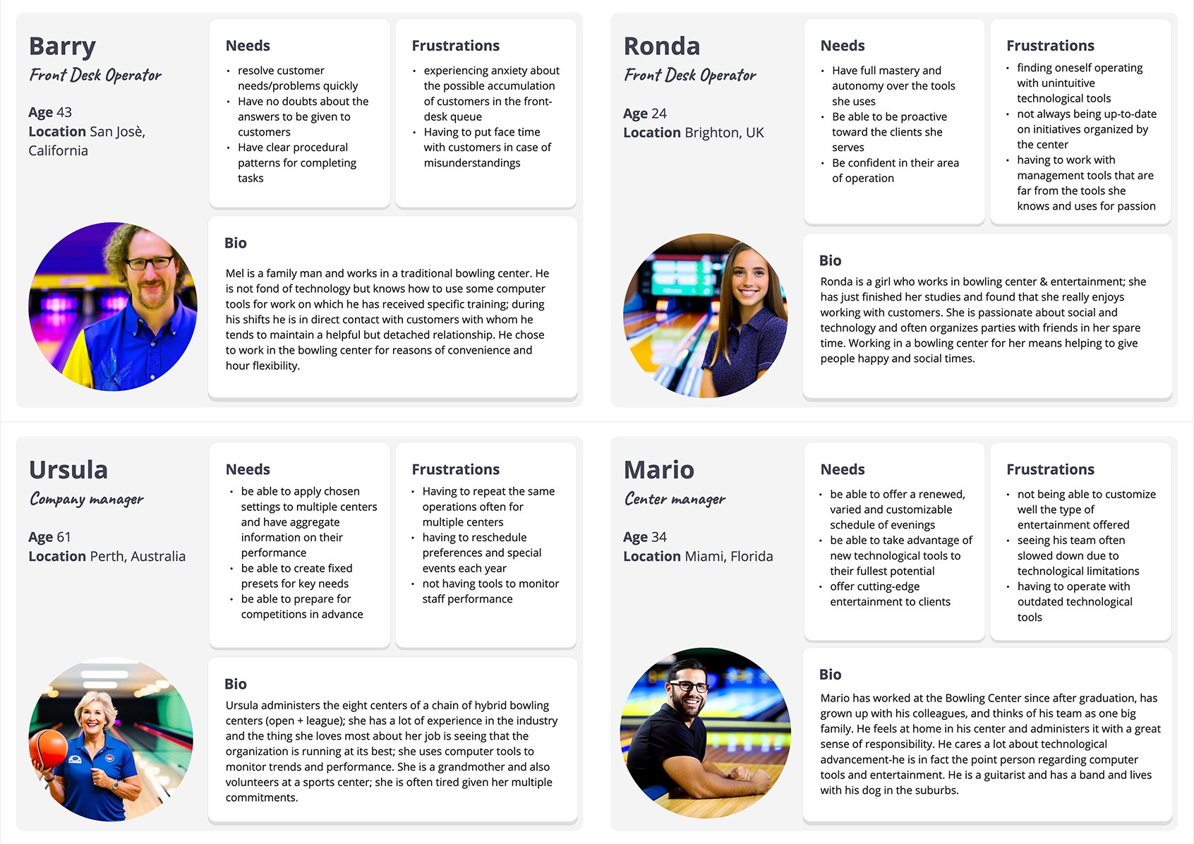
User Personas, customizing scenario
User Journey Mapping
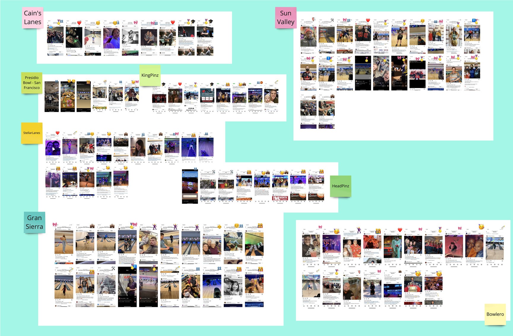
Social Media research for B2B2C, with a focus on end consumers’ needs and opportunities.
Define specific product goals for QDesk:
Feature Goals
Targeted Presets: Implement presets customized for different user profiles.
Depth System: Expand options by introducing multiple levels for greater flexibility.
Usability Enhancement: Improve how options are presented to enhance the user experience.
UI/UX Consistency: Maintain a consistent interface design for familiarity.
Clear Confirmation/Error Handling: Enhance clarity in user flows during interactions.
Effective Communication: Ensure informative prompts and feedback during processes.
Separate Operations: Where feasible, separate front desk and back office tasks.
Intuitive Interface: Create a user-friendly interface that is easy to learn and train on.
Research to define workflows and architecture:
Visual Brainstorming
Product Workshops
Focus group
The Venn Diagram
Affinity Diagrams
Personas pain & gain map
Tasks analisys
Card Sorting
Iterative Prototyping and Visual Design:
Storyboards, Collage your world
Tree Testing
Wireframing
Value Ranking
AB testing
Visual hypothesis
Defining User Stories
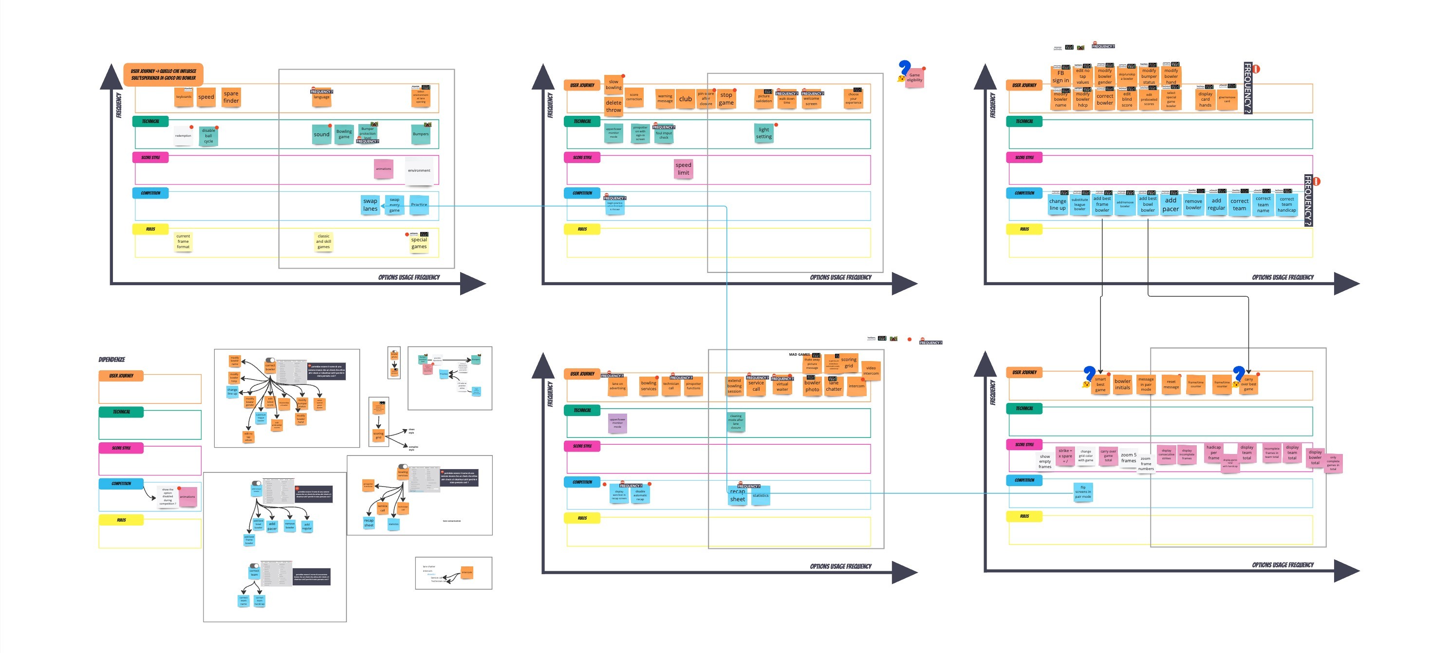
Changing Main Options Case
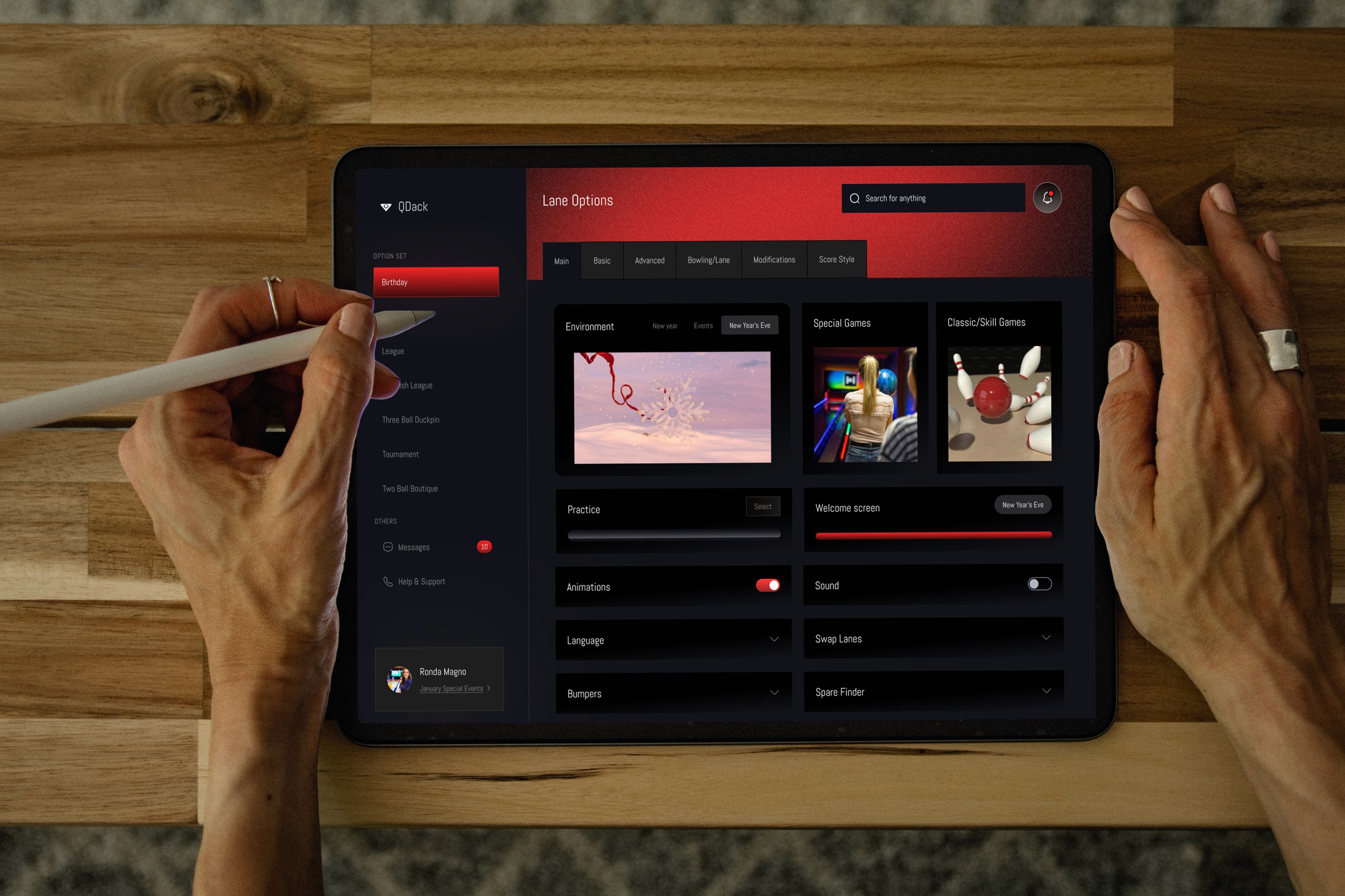
The user interface features a dark theme strategically chosen to coincide with peak usage times-often in the evening when environments are dimly lit. This design choice aims to reduce eye strain and increase user comfort during extended screen sessions. In particular, the actions associated with the visual options are clearly differentiated from other technical elements within the interface, and the UI seamlessly integrates brand colors and harmonizes with the existing dark Conqueror X environment. I also wanted to address a change in devices as tablets take over the entertainment center and become multitasking tools.
The Visual Result.
The user interface features a dark theme strategically chosen to coincide with peak usage times-often in the evening when environments are dimly lit. This design choice aims to reduce eye strain and increase user comfort during extended screen sessions. In particular, the actions associated with the visual options are clearly differentiated from other technical elements within the interface, and the UI seamlessly integrates brand colors and harmonizes with the existing dark Conqueror X environment. I also wanted to address a change in devices as tablets take over the entertainment center and become multitasking tools. However, ongoing discussions focused on customization and technical integrations for the bowling center's unique brand identity, so this is just a sample of what's possible, but several points and solutions remained open.
Ho avuto il piacere di poter lavorare insieme a Simona presso QubicaAMF anche se eravamo in team diversi. Simona è una professionista nel settore UX/UI, molto disponibile e sempre con il sorriso. Se cercate una persona con competenze nell'Usabilitá ed IA Simona è la persona giusta per voi!

Gianmarco Bassini
QA Specialist · Manual Testing · UAT · Regression Testing